Sunday, 22 February 2015

Questionnaire Results Analysis - SurveyMonkey

In this task I have both planned out and constructed a online survey for the audience to fill out. The questions which I have implemented into the survey were mainly closed questions which allowed me to gain a clear answer from the audience. Additionally I did not use any double negatives in constructing my questions therefore the questions were not confusing for the audience. By this I have made sure that my survey is quick and easy for the audience to answer which would not make it boring, because if the survey would be boring the audience will not be encouraged to answer truthfully and with full potential. This made my survey very reliable and by this I can use it as a guide onto my own magazine creation. Below I will show and analyse the results which I have gained from the survey using SurveyMonkey.
In the first question of the survey I have asked my audience to specify their gender. As we can see the female gender has dominated the male gender. 8 results were from the female representatives whereas 5 results were from male representatives. By having a variety of genders answer my questions I am sure that my results will not be bias in terms of only female or male points of view. However, concluding from this result I will consider my magazine to be more focused on the female audience rather than the male audience meaning that I have to consider my magazine containing more content which would be targeted at females.

The next question which appeared in my survey was the "What is your age?" question. By this I was allowed to easily acknowledge the age of the people which answered my questionnaire. We can see from the result graph that the age group which mainly filled out my survey was 16-19 year olds (average sixthform/college students). These were followed by 20-23 year olds. By this I know that the answers which I will gain from the survey will be specified for the 16-19 target audience. This means that when following the results from the survey I will make sure that the magazine is aimed at 16-19 year olds, however it can contain content which is also tailored for audiences of 20 years old+.

 In order for me to conclude upon what music genre my magazine will be based on I have decided to add a "What is your favorite music genre?" question. By doing so we can see that the answer which I have gained is mainly Hip Hop genre with nearly 40% of answers, followed by Pop and R&B/Soul. Concluding from these results, I will create my magazine to be focused on the Hip Hop music genre, however to make it reach a wider audience I will include features which will match the Pop and R&B/Soul interested audience. This will increase the sale rate of my magazine.

The purpose of listing the above question in my survey was to see how often the audience which answers my survey purchases magazines. As we can see the "Not at all" answer has dominated in this question with over 69%, followed by "Slightly Often" and "Moderately Often". This shows me that no individuals tend to purchase magazines often. This could be beneficial for me, as by the audience filling out the rest of the questions they can tell me what they would like to see in a magazine, which they did not already come across. By this my magazine could be specific for them which would attract their attention.

In the above question we can see that I have asked the audience about the budget which they would like to spend on a music magazine. From the table below the graph we can see that the "£3 - £4" answer has been chosen as the most favorite. This benefits me, as during my magazine planning I can easily make out the price which I will set for the magazine to make sure that it is attractive for the audience. On the other hand we can see that a certain percentage of the answers have been targeted at the "£1 - £2" answer. Concluding, to make sure that I am generic with my decisions, I will set the final price for the magazine to be £2.50. By doing so I have chosen a price in between the two answers, which will be satisfactory for the audience.

Next of all, I have asked my audience what colour scheme they would like to see throughout the music magazine. In the above question I have provided my audience with a variety of colour combinations to choose from. However we can see that the "colourful/eyecatching" answer is definately dominating in this situation. On the other hand we have individuals who would like to see "elegant" or "contrasting" colours in the magazine. By this I conclude that during my creation of the magazine I will make sure that most of the colours used in the magazine will be "colourful" however I will implement "elegant" or "contrasting" elements.

In this instance we can see that the question has provided me with a variety of results. Some of which are definitely chosen by the audience and with some that could be used forward into my making. Looking at this from another perspective, all of the listed features are useful towards my magazine making therefore to make a full use of the results I will use all of the features. However looking at the results, I can make out which features are more important than others therefore the features which gained a large amount of votes will be definately used, whereas the features with few votes may or may not be put forward into my making depending on the design which I create. The question has been specified to show what the audience likes to see on a front cover therefore by this I have easily acknowledged what my music magazine front cover has to contain.

Same as in the question before we can see that my audience has voted for many features, however in this question we can see that one feature has not been chosen by any individual. This is the "negative space" feature. By this results I have been clearly shown that negative space is not to be used in my contents page therefore during my magazine creation I will have to consider amendments to limit the negative space. Moreover, we can see that "Headings", "Images", "Clean layout" and "Creative use of colour" have been favorited amongst my audience therefore I will definately choose them to be implemented into my design. However features such as "text layout" or "quotes" which gained fewer results will also be put into my creation, but with a smaller attention as they are not as needed. By providing these features with smaller results I will make sure that the magazine matches my audience as most as it could be. This results have clearly shown me what features should my contents page contain in order to match their liking.

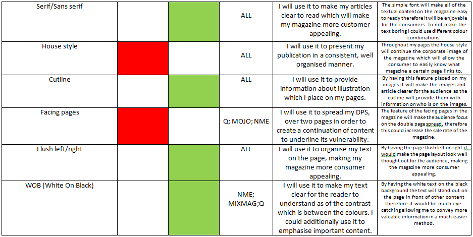
As the two questions before we can see that his question has been specified to show me what the customer would like to see on a certain area of the magazine. This time I have specified the question to be about the double page spread (DPS). The results which stands out the most is the "large title/headline" that has scored 8 votes. This feature would be definately used in my magazine creation as it would make the information stand out, as well as making my magazine follow standard formats as large headlines are mainly used on double page spreads which I have acknowledged from my magazine analysis. In this instance I will choose to use features which score 4 votes or above, meaning that my magazine will definitely use "facing pages", "pull quotes", "large title/headline" (as said before) and "images split onto two pages". Other features can be put forward and used depending on the design that my magazine will follow.


 In this last question of my survey I have asked the audience about the features they would like to see throughout a music magazine. The results which I have gained are self explanatory. We can see that all of the listed features have been voted very high therefore I will consider to use them in my magazine creation. However the two features that will not be seen in my magazine are "advertisments" and "reader interactions". I have not chosen to use them as in comparison to the amount of votes other features gained, they are not liked by the audience. By doing so my magazine will be made up to my audiences liking therefore it will be tailored to them, making it a appropriate magazine for them. On the other hand, this question has been very different to others as we can see that I have been provided with a "other" answer. The comment which has been provided says "upcoming events". This feature has been hinted by a audience member to me. I consider this feature to be very helpful as it would be very informative for my audience and by it being transferred in such a way to me showing that it is needed, it will be put up to use during my magazine creation.

Wednesday, 18 February 2015

Planning My Questionnaire

What do I want to know?
In this task I am to plan out my questionnaire for my music magazine. By the use of a questionnaire I will be allowed to broaden my research and gain third party feedback which will influence my making of the magazine. I plan my questionnaire to ask questions which are vulnerable , which as a result would help me decide upon the elements which I will include in my magazine. My goal of this research is to gain as much information about the audience as I can in terms of their personal likings and opinions which would allow me to tailor my design to match their specification, making the magazine convenient and enjoyable.

What information do I need?
From my respondents I will aim to gain specific, truthfull information as by this it would make my research very effective. To make sure that I gain information which are trustworthy I could specify to the audience that the information which they include in the questionnaire will be confidential, and used only for my own personal use. This would make the audience more confident with the questions as by this they can provide me with their own opinion, not what they want me to think. This questionnaire needs to provide me with information on what the audience would like to see in the magazine such as the images, features, colours etc. I will benefit from this as by basing my creation on the information I gain, I will allow my magazine to be tailored to my specific audiences liking therefore making the magazine more consumer appealing. On the other hand, from the questionnaire I would like to know what interests people have as this could provide me with a hint upon what content I can include throughout my magazine.

How am I going to analyse each question to get the results that I need?
In order to gain the information that I need I will choose to analyse the information using various methods. One of them is to use bar charts or pie graphs. By this I present the information visually which makes it very easy to understand which option has the most votes. On the other hand If I gain information which is out of the criteria such as the persons own opinion I can compare the responses, list how many similar responses there are and upon that make my final decision.
Analysing my results is a crucial part of my magazine planning as by this I get a clear idea of what my magazine should contain and how it should be presented. By this the magazine will be succesfull as it will match the audience.

Time Management:
I plan to send my online survey and give out my paper based survey and gain the results during a 7 day period. By setting such a deadline for myself I will make sure that I gain and analyse information very quickly. This would allow me to plan my magazine design, layout and content that will be included in it which then would allow me to immediately begin creating my magazine in class.

Criteria To Be Used In My Magazine Manufacture


Wednesday, 11 February 2015

Analysing Magazine Layouts - Already Existing Music Magazines

In this task I was to look at the current music magazines which are available on the market. The part of the magazine which I have especially focused in this task was the layout, meaning that I have looked at where different objects were placed on the canvas of the pages. To gain a wide variety of ideas I have looked at three different magazines and studied the front cover, the contents page and the double page spread for all of the magazines. By this I was allowed to notice similarities and differences between them, allowing for me to feedback on what parts of the magazines are succesfull. By this I have gained information and was inspired on what features I should include in my own music magazine while designing and creating which would make my magazine follow the standard formats and look more professional.


Monday, 9 February 2015

Music Magazine Research

In this task I was to analyse current existing music magazines in order to gain sufficient information about their reader, the language and features used withing the magazine and their effect on the consumer. By this I have gained sufficient knowledge; This has provided me with inspiration towards my own magazine making.


Monday, 26 January 2015

Brandeye's for magazines

In this task I was to fill in the brandeye's for my chosen four magazines, which in this case are MOJO, Q, Mixmag & NME. While looking for the specific criteria, I have performed a research by looking at the magazines online as well as looking at hard copy magazines. In my opinion this has helped me as I have picked out factors which are valuable in the magazines, making them appealing to the customer and persuading the customer to buy them.I intend to put these factors into my own magazine making as I target my magazine to be as professional as possible.


Monday, 19 January 2015

Q Magazine Research


Founders Mark Ellen and David Hepworth were concerned about the music press at the time, therefore they have came up with this magazine. Q was published by EMAP media group in October 1986. At the very start the magazine was standing out against its competition as of its high quality of production and monthly issues. In the early years of the magazine, it was sub-titled "The modern guide to music and more". With world-beating exclusives, definitive album reviews, outstanding production values and an inimitable sense of humor it has shaped the music in UK and beyond. 97% of Q's male, 15-34 years old audience rate it as a quality magazine.


Front Cover:

At the first glance on this magazine we can see the "Q" masthead. In comparison to my previous magazines, this masthead is pretty unique. I consider it to be different than the others as it only consists of a letter and a square background which makes it look like more of a logo. On the other hand is it very classy, eye-catching and simple which presents the brand very clearly to the audience. Due to its short name "Q" is easily remembered in the readers head, which ideally has an effect on the consumption. The masthead is positioned in the top left corner of the magazine which amongst the magazine market is considered as a stereotypical placement of the masthead. Most magazine place their mastheads in this exact position as it causes the brand to be very visible. Again, comparing this exact masthead to other mastheads visible on other magazines we can see that in fact it covers the main image. To us, it shows the vulnerability of the brand itself which reinforces the ideology of promoting the brands name.

On the front cover we can see that a puff piece has been placed flush right, roughly in the middle of the magazine. The puff line has been placed in a circle which makes it look like a sticker. By this it stands out, as the only shapes visible on the page are squares or rectanbles. Additionally the colours used in this puff piece create harmony and work well together in order to present the text. By this the text is easily conveyed to the audience and draws the attention to the 'sticker' presenting exclusive content which is inside the magazine.

In this case the barcode is placed in the top/middle section of the magazine as in comparison to other magazines which I have analysed. The barcode is essential for the magazines as by this they can be legally sold in stores. On this front cover we can see that the barcode has been placed flush left right beneath the masthead. In my opinion it has been placed there by purpose as the masthead drags our attention away from it, therefore we do not notice it. 

The main image of the front cover is set that it fills the whole page, bleeding with the margins. In the image we can see Cheryl Cole which later on is even underlined by a main cover line. By the image filling in the whole page it attracts customers as when the magazine is placed on a newstand, it allows to tell the audience the genre of the magazine based on the image. Cheryl Cole is a famous celebrity, which as a result will mean that the circulation of the magazine will be high as the readers know her therefore they will be more persuaded to pick up the magazine. In terms of mise-en-scene on the image, we can see that Cheryl Cole wears a top which presents a large amount of her skin. Additionally her body positioning e.g. ring touching her tounge she is presented in a "sexually appealing way. This may cause this exact issue to have a bigger interest amongst the male audience as they will be attracted by the impression of Cheryl Cole.

The main cover line on this cover states " 3 words... Cheryl Cole ROCKS". The postitioning of the text from "3 words" being the smalles and "ROCKS" being the biggest, has a very positive effect as it gives us a impression of creating tention. Additionally for each part of the main cover line, a different font style has been used. Begging from what looks like a free-hand style font, to a heavy, bold font and finishing in a thin, tall serif font. The part of the cover line which to me was seen as the most important was the text "ROCKS". This is because the font is written in red which continues the style of the masthead, however the kerning used in the word "ROCKS" has made the text spread across the whole width of the page. While reading the cover line we may feel as we are taking steps on to getting into the main points of the story. Furthermore, the colour red could be refering to the main image as we associate red with 'sexual' connotations.


Double Page Spread:

While looking at the double page spread we can see that it has been sorted neatly onto two seperate pages. On the left we can see a image of the subject of the article which takes over the whole page whereas on the right we can see that the page has been dedicated for the article about the subject which in this case is Lady Gaga. This layout is very clear and understandable which presents both graphical and text information in a clean manner. The columns have been separated with a suitable column gutter, allowing for the text to be spread out which increased the clarity of text allowing the reader to flow through the text quicker without any vast problems. The sorting of text into columns have emphasised the amount of written text which makes the article look very detailed at the first glance. 

The main image of the double page spread is placed on the left page of the double spread. In my opinion it is one of the CVI's which we can see on the double page spread as of it's size and sexual connotations. In the image we can see a celebrity - Lady Gaga who covers her breasts using her hands.  While taking the photograph, Lady Gaga's eyes were pointed straight at the camera which as a result has made it seem as if we as readers, come across a eye contact with the celebrity. 

The article on the right page of the double page spread has used a simple serif font throughout all of the columns. To me it suggests that in this case it is not about how attractive the text looks, but who the text is about which again it is about Lady Gaga. By the simple font being used for the article, it can suggest to us that a more mature audience is targeted by the Q magazine as they pay more attention to the quality and amount of text rather than its presentation. Additionally, we can see that a drop cap has been placed in the article. This plays the role of a sign where the article stars as the large font attracts our eye. Lastly, on top of the article we can see a huge letter "L" being overlayed in red. This suggests the name of the celebrity as it is the first letter of her stage name - Lady. In my opinion, this is very effective as it is considered as a CVI on the page, because our eye is attracted by this to the article. The red colour has been specifically used to overlay the letter as it creates a strong cotrast against the negative space behind the article text, however it additionally continues the Q masthead image and the sexual connotations.

A sub-heading has been placed in the top right hand corner of the page which is used as a chapter indicatior. This suggests to the audience what content the page will contain as when they are flicking through the pages the first thing they see is the top right corner of the page. By the wide kerning between the letters the simple phrase "Lady Gaga" has been emphasised to show her value to the magazine. Additionally the phrase has been seperated into two fonts. "Lady" has been written in a font which depicts more female characteristics whereas "GAGA" has been written in a capital, serif font.


Contents Page:

At the very top of the page we can see a header which is a thick line which passes through the width of the page. The line has been filled in with black, for the white "CONTENT" text to stand out. Additionally, on the left of the text we can see a Q masthead being implemented into the line. This has created a contrast against the rest of the black line which shows the importance of the "Q" brand and their content. This heading follows the red/white/black colour scheme of the Q brand. Furthermore, this "line" could count as a leader in terms of presenting the issue number and date of the magazine as by the black background, this specific information is excluded from the rest of the page.

On the left of the magazine page we can see that a column has been created in order to show what content can be found throughout the magazine. We can see that the column has been sorted into two sections which are: Features and Every Month. The features section shows us the content which is specific to this specific issue of the magazine, whereas the Every Month section show the content which is visible in each monthly issue of Q magazine. The "Every month" heading has been underlined by a red background to show that it is a part of the "Q" image. As an addon we can see that there has been a selected section within the Features column, which is called "Women in music". This section has been dedicated for women and its content is emphasised by a different coloured background. The font used for the text in the columns is very straight forward and follows the red and black colour scheme making the text easy to read and find on the page.

The main image which we can see on the page is on the right hand side right beneath the header. In the image we can see Adele, a female singer. By Adele being in the image, it directly links onto the "women in music" section withing the features, which tells us that this issue of magazine has been dedicated to females in the music industry. Her posture and face expression is very mature and she makes eye contact with the camera. As a result of that we as readers gain a positive image in our head about the person. On the other hand, by the image being a close up we are not shown any other content different than her emotion-less face. By this we as readers are intrigued onto finding out what the article says about her as we cannot make out any key areas from the image. 

Furthermore, Q has a review section which is positioned at the bottom right hand corner. Other magazines which I have analysed also contained a review section however they were blended in with the rest of the content index. Q has made sure that the reader focuses on the review section, by excluding it from the rest of the features and placing it in a separate section. This is a very effective method to show content as it dominates over other features and we can see that it uses the same header as "CONTENTS" which shows that Q as a magazine pays a lot of attention to this section. By separating the reviews from the rest of the features it makes it easier for readers to find this section and look directly into what it contains.